Wednesday, 14 November 2012

Music Magazine Contents Analysis


This contents page uses a grey background, this makes the page appear professional. This works well, as the main image is quite simple yet adds enough colour so that the page isn't too dull to look at. The background colour works well in not making the colours clash, and making the page look neat. The other colours used are black, white and red which go together and with the grey. The contents page uses one or two different fonts which makes it much more interesting to look at; the style of the font is simple yet stylish and suits the target audience of the magazine, which makes it more appealing to them. The colours are symmetrical to those used on the front cover, giving the magazine fluency and this helps to make the magazine recognisable to their audience.

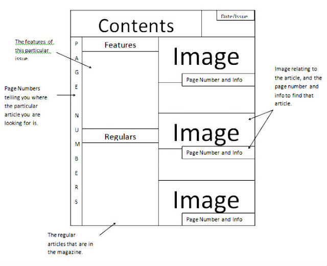
Each section has a heading above it, and then many sub-headings for each subject with brief information on that subject and has the page number beside it. This is to make the magazine more accessible to their audience, easy for them to read and and also looks professional and presentable. The fact that the magazine uses catagories and sections makes the magazine appear much more organised and neat. This also helps to identify the target audience due to the topics used in the magazine.

The contents page uses a large main image, and it's placed centrally. It gives the audience the information on the main feature of this article, and is also really appealing to the target audience as it looks neat and well-organised. There's also a smaller image placed below it, showing a different article and making the page look interesting and helps to represent the subject of that article.

On the top right of the page, in the same bar as the title, it tells us the date of the issue, which shows the typical conventions inside a magazine.


The largest text on the contents page is the title "NME this week". This is the first thing that you notice, therefore this will draw the audiences attention and will be recognisable. The colour scheme in the contents page links with the front cover, making it look professional and organised, which will capture the audiences attention. The red and black are relevant to the target audience of this magazine, stand out against the grey background which catch the eye of the audience.

The articles are split into sections which makes the magazine appear much more organised and neat. Due to the topics used in the magazine, it also helps to see who the magazine is aimed at. There are sub-headings and a brief information on that subject, and it has the page number beside it. The information is enough to interest the audience into reading the topic, therefore enticing them to buy the magazine and the page numbers and sub-headings together make the magazine easily accessible, and look presentable.
 
The main image is of a building, with a black background so that the audience can see the image clearer, it stays true to colour scheme of the magazine and also since it stands out against the background of the page. The image is relevant to the target audience of the magazine and the theme of it also, since its an image of a famous music venue, which persuades the audience to read the magazine. The article title and page number below the image in a large font, so that the audience can find the article fast and efficiently.
 

Just below the title, it tells us the date of the issue. This shows the typical conventions inside a magazine and lets the audience know how up to date the issue is.

Tuesday, 6 November 2012

Music Magazine Cover Analysis

Target Audience
Their primary audience seem to be mid teens - early twenties, since they use bands/singers that have been around for a few years that would be immediately recognisable to that audience, such as Arcade Fire. The secondary audience would be people in their mid thirties+, since they also mention bands/singers of another generation, such as Bob Seger, which would entice them into reading.

Sell Lines

The sell lines are on the right side of the magazine, which makes the cover look neat and in order. The subtle hints to the topics in the sell lines is successful in interesting the audience, and helping to persuade the audience into reading. The font also looks professional and is easy to read, and since it's white and stands out against the background it is much more appealing to the eye. Also, the topics help to identify the target audience of which the magazine is trying to attract. 

Masthead
The masthead is large, in the top centre of the magazine and isn't covered by the main image. The positioning of the masthead, the font style and the bold red colour is a clear logo to the magazine, therefore giving a sense of familiarity. Also, with the use of a shadow effect on the title, it appears to stand out even more, drawing the audiences attention. Finally, the fact that the red isn't shown anywhere else on the front cover apart from the masthead makes the magazine look a lot more neat and professional looking, which makes it more appealing to the audience since the cover isn't overtaken by colour. The magazine gets it's name from the Muddy Waters song "Rollin' Stone" which is relative to the magazines theme of music, since it gets its title from a song.

Main Image
The main image is large and covers the entire front page, and helps the audience learn more of the content of the magazine as the subject of the image is Adele, one of the most famous singers at the minute, so that would already persuade people to buy the magazine. The image is a head shot of her, and she's looking out to the audience, drawing you into the magazine. Another feature that emphasises the image even more is that the editing of it is subtle yet striking, she looks sharper and as the background is plain and basic, she stands out a lot more. Also, the positioning of the image is a great way of drawing attention, since she's in the centre of the magazine, the focal point of the cover.

Anchorage Text
The anchorage text is in a fancy font which is in a bright plain colour which compliments the image, giving it a sophisticated, professional look. It's subject is short and simple, not giving you much information but enough to interest you, making the audience want to read it.

Skyline
The skyline is giving you information on this issue, telling the reader that its a special issue. Since it's a special issue, you're interested almost immediately. Then, it says next to it the reason why it's special, that it's a rock issue. This attracts fans of rock music to buy the magazine, however since Adele is the main image and isn't in that genre of music, it shows that the magazine caters for a mixture of genres. Finally, The text is clear and medium sized, and is white in colour, so it catches your eye.

Colour Scheme
The colour scheme of the magazine is black, white and red, which are maintained throughout the magazine, which makes these colours a familiar feature to this magazine. Also, these colours help to enhance images, since they are bold. The fact that on the cover they use red only in the title is effective as it helps to make the name of the magazine even more memorable and recognisable to their target audience. The colours are eye-catching and quite classic, which suits the magazine well, since it has been around for a while and is very well known, making it quite a classic magazine. Since there is a limited use of colour, it makes the cover a lot more attractive to look at and also makes it a lot more presentable.


Target Audience
The primary audience would be mid teens - early twenties, as some of the bands/singers mentioned are popular in the music industry today, such as Mumford and Sons, therefore the primary audience would be attracted to reading about them. The secondary audience would be people in their mid to late thirties+, as they mention older bands that were popular to that generation, like Madness. The fact that they cater for both young and old will  give a sense of warmth to both audiences and will persuade them to buy the magazine.

Sell Lines
This magazine includes quite a few sell lines on the right side of the magazine cover. They are in bold, and black and red which is inkeeping with the colour scheme of the magazine, which makes it instantly recognisable. Although they make the magazine look a little cluttered, it also shows the reader that they are getting a lot of information on the topics inside, making them interested in reading the magazine. Also, the sell lines help identify who the target audience is for the magazine.

Masthead
The mast head in on the top left corner, and is just the simple letter Q surrounded by a bright red square, which is really eye-catching. The fact that the masthead looks more like a logo, stays true to the colour scheme and is bright makes it much more memorable and easily recognisable. Also, the placement of the masthead is different to some of the other magazines, showing originality to the audience. The fact that they don't cover the masthead gives a sense of pride of the magazine, and makes it look much more presentable and neat, which is much more appealing to the audience. Originally the magazine was going to be called Cue (as in the sense of cueing a record, ready to play), but the name was changed so that it wouldn't be mistaken for a snooker magazine, and also because a single letter would be more prominent, drawing peoples attention and also more memorable.The name of the magazine is therefore relative to the music theme of the magazine.
Main Image
The main image is large and entirely covers the centre of the magazine, which would catch the attention of the audience and would be the main focal point. The main image is of Noel Gallagher, who is a very popular figure in the Rock genre, so this would immediately strike the attention of Gallagher fans, Oasis fans - which was his band before he left - and also Rock fans. The image is a full body shot, which is quite rare for magazine covers. He is looking directly out towards the reader, which gives them a sense of involvement and appeals to the reader. The image is barely edited, but since the background is plain, he stands out well.

Anchorage Text
The anchorage text is in a medium, basic font, which is easy to read and gives the magazine a professional look. It's topic is short and simple, not giving you much information but enough to entice the audience, making them interested and want to read it.

Colour Scheme
The colour scheme of black, white and red is maintained throughout the magazine, making these colours recognisable to the magazine. The colours also help the magazine to appear much more presentable, and giving it a stylish look. The use of these three colours help the other colours to stand out, which helps other important features in the magazine to be noticed. The green is used to promote the 'Albums Goldmine' which stands out as the colour isn't a reoccuring colour on the cover other than on the speaker beside Noel where it says 'Russell Brand murdered the Beatles!' the colour seems to be a way of grabbing the audiences attention, therefore persuading them to have a look at the magazine. The magazine looks presentable because it doesn't use a great deal of colour other than the red, which is bold and striking.


Target Audience
The magazines primary audience seem to be mid teens - early twenties, since they seem to promote bands/singers that are popular today on the cover much more, like Paramore and Biffy Clyro and this would be immediately appealing to this audience. The secondary audience would be eary thirties and above since they also mention bands/singers that are quite old, such as Ozzy. They cater for a mixture of age groups, and different styles of rock music which the audience would appreciate and be more likely to buy the magazine.

Masthead
The masthead is instantly recognisable to this magazine with it's ragged, cracked text which is well known to the readers of the magazine, and also very fitting to the target audience. The title is partially covered, which shows a sense of confidence and modesty, that they don't feel the need to show the title of the magazine for the audience to know which magazine it is. The name of the magazine 'Kerrang!' is an onomatopoeic word that derives from the sound that is made when playing a power chord on the electric guitar, this fits to the theme of the magazine and also is attractive to the target audience.

Main Image
The main image on the page is the largest and is certainly the focal point of the cover, therefore gaining the interest of the magazines target audience. Also, the fact that the image partially covers the masthead and is central on the page shows the significance of the image and it's importance in this issue. The main image is of the band Biffy Clyro that are big at the moment, which will get the attention of their fans, persuading them to buy the magazine. The icons that are in the image are also inkeeping with the colour scheme of the magazine- which is black, white and red- making it look much more presentable and appealing to the audience. Also, the fact that the image has been edited to make the contrast appear stronger makes the image stand out much more, and grabs the attention of the reader almost immediately.
The magazine is also successful in using smaller images at the bottom of the page, advertising posters. They don't use many images, therefore it looks neat. The use of smaller images will be effective in getting the attention of readers.

Anchorage Text
The largest text is the title of the band 'Biffy Clyro'. This will tell the audience the subject inside the magazine. The text below the title saying 'Unfold the puzzle of life...' has a black background and white text, which helps it stand out against the main image, therefore catch the attention of the audience. It also doesn't include much information, but enough to entice the reader into having a look inside the magazine.

Skyline
The subject of the skyline is advertising a free ticket giveaway to Download. This will be a good selling point for the magazine since they are advertising freebee's, which very few music magazines offer, therefore making the magazine much more appealing. Also, the white text against the read background and medium sized text will catch the readers attention.

Colour Scheme
The common colour scheme of red, black and white are maintained throughout, making it look crisp and neat, but also subtly catching the eye of the audience since the colours are bold and striking. The colours also suit the theme of the magazine, since common colours in the rock genre are black, white and red, therefore aiding in grabbing the audiences attention. The only text in red is the one that says 'Paramore', which is bold and stands out against the white of Hayley's top, and this is used to promote the band and grab the readers attention. The rest of the text is in white, against a red background, which will clearly be easy to read and will catch the eye of the reader, making it more attractive to look at.

Friday, 2 November 2012

Mock Up Front Cover Analysis

 
How does your media product represent different social groups?
My magazine represents the particular social group firstly because the masthead is simply 'College' and is very relatable to the audience since a large majority of the audience is teenagers. The sell lines represent the audience as they fit the interests of them and one of the sell lines 'Student Style' clearly addresses them, making them interested and more likely to buy. The colours of the magazine are bright and eye-catching, and are colours that teenages would like. Finally, the main image is of a girl who is clearly around the age of a majority of the audience, representing them. This would make it more relatable to the audience and much more appealing to them, too, persuading them to buy the product.
 
What kind of media institution may distribute your media product and why?
  I looked up media institutions, and If I had to choose a company to print and distribute my magazine it would be IPC. They print magazines and distribute them to stores all across the country, stores such as WHSmiths and etc. It is the leading magazine publisher in the UK, producing over 60-70 media brands. Since this company has a great reputation and is reliable and professional, this would be a great company to have distribute my magazine as it would make it successful and easier for the target audience to get hold of. 
 
Who is the audience and why?
The primary audience for the magazine is college students around the ages of 16-18 as it is includes relevant information for the reader to help them out with college and also because it is specifically made for college students in particular. My secondary audience would be students that will be going up to college, I have chosen this audience aswell because they will most likely read this magazine to find out more about college life and what to expect. It also has all the details on the cover that would appeal to this audience and also the primary one too. There's a possibility that parents may want to read this magazine to find out what college life is like and what their children will be going through and want to find out how to help them out if they are struggling.
 
How did you attract/address your audience?
I attracted my audience with the use of styles that would be used in a usual standard magazine that would create a sense of familiarity which would help persuade the audience to buy it. Also, I used bright colours and simple bold font styles that would catch their eye and interest them. Also, the main image is of a female the same age as the target audience, so they would be able to relate to her and since she is looking out directly and smiling, this would create a sense of warmth, making it more likely for the audience to buy the magazine. Finally, the sell lines are simple yet interesting, which would make the audience want to read more and the overall look of the magazine is simple and attractive and this would make it much more appealing to them. 
 
What have you learnt about technologies from the process of constructing this product?
I have learnt several skills in the process of constructing my magazine. From the programme I used to create the cover, Pixlr Express, I learnt how to make an image more appealing by increasing the vibrance and contrast of the image and also making it brighter and and sharper, giving the image a more professional look. Also, learnt how to add an image onto the cover by getting an image of a barcode and placing it in the bottom right corner. Finally, I learnt that less is more. If you use a bold, simple text and a short, interesting sell line it makes the magazine much more appealing to look at; the less text used on a cover, the less cluttered it and interesting it looks and also persuades the audience to buy it.


Mock Ups: Cover and Contents

Cover Page Mock Up

Contents Page Mock Up